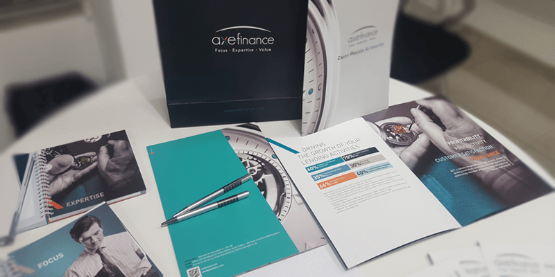
axefinance unveils brand new visual identity

We’re releasing an updated brand identity, which includes our new logo, colors, font and visual style.
Our stationery, website, and social networks have been updated, and soon you’ll notice further changes in ACP with more flexibility and an improved user experience including a responsive interface. The fresh look not only illustrates how far we have come since our founding in 2004, but also inspires us to look ahead towards our goal of becoming a global leader in software that modernizes all aspects of the lending cycle.
With the old visual identity feeling dated, it was time for a change. Our primary design objective was to better communicate our positioning and values to our customers. We worked hard to find something that not only appeared visible and fresh, but also elegant.
Focus, Expertise, and Value are now fully integrated as parts of the logo. These continue to be key points of orientation:
- Focus is what distinguishes us:
We strongly believe that by choosing to Focus on our area of specialization we’re offering one of the best credit automation solutions in the global market with an optimal total cost of ownership. - Expertise and Value are what we intend to deliver:
Because of our focused positioning we are in an optimum position to deliver to our customers the Expertise they demand at the Value they expect
We hope you like the new look and feel of axefinance!
Check out our new brochure and website to get a feel for the new visual identity.
This new visual identity was designed by Garcicom and implemented in the new website by Novatis.
